Wednesday 18 December 2013

Mastheads & Images

I still haven’t decided on a brand name, despite having chosen the font for my masthead, because I want to see which would go best with the images from the photoshoot. These are some examples where I have tried out different mastheads with different photos.


These are very rough drafts. I like the way the image is superimposed on the right but it's difficult to read the masthead.


Original vs. Edit


In the original image there are background objects that distract the viewer from the two main subjects and the image is overexposed, making it appear quite bland and colourless.
In the edited version I have cropped the image so that the background objects aren't in it and so that the two subjects intercept the grid lines of the rule of thirds, drawing more attention to them. I have also added a hue of warm colour, making the photo appear brighter and more interesting.


The density of the leaves behind created a good backdrop for the photo, drawing more attention to the light clothes of the subject.
I added a warmer hue to the picture to draw further attention to the colour of the subject's lips and to make the picture appear a little brighter.


Unfortunately in this picture the light from the windows behind the camera created a pattern on the plain white backdrop.
I edited the picture to give a different background, to get rid of the pattern from before. However, the light from the original picture still makes the left subject's hair hard to blend in properly into the background and the photo may be too 'busy' to use in a magazine.


Photoshoot Evaluation

Monday 9 December 2013

Flickr Account Link

This is the link to my Flickr account, where I'll be posting pictures from my photoshoot. So far I have only posted photos I have edited, though at a later date I'll be posting the original photos along with the different edits I have tried out on this blog.


Wednesday 4 December 2013

Mood Boards & Photo Planning

These are some images I find to make either good magazine front covers or double page spread illustrations. I think most of the images on the second mood board would be best for a double page spread.


In the above mood boards I don't feel that I have found images that relate to the genre of rock very well, despite the images being good for inspiration. I will still use them for ideas, but the images below I think show the genre of rock music well. They give ideas for potential costumes and makeup for the subjects of my future front cover, as well as showing the ideal quality of the photo and the type of shots I'm thinking of using, etc.


Below is my timetable for the photo shoot. I'm using my friends Phoebe and Helen as models, as they are my first preference due to their unique appearances. I also like the contrast between their hair colours, which will hopefully create some variety within my photos.

Picture
Time & Date
Model/Pose/Costume/Makeup
Location
Lighting
Set-up time
Mise-en-Scene
Camera Angle & Distance
1
8/12/13
1.30pm
Phoebe – heavy eyeliner, bright red lipstick, denim dungarees with fishnet tights, choker and long-sleeved black top.

Helen – heavy eyeliner, bright red lipstick, grey crop top, high-waisted denim jeans, cross necklace, choker, silver ear cuff and black leather jacket.

In my dining room, with white sheet being used as a backdrop.
Flash
Sheet set up – 5 minutes.
Make up and costume – 30 minutes.
-          White sheet to create blank background

Mid shot, tight frame with both Phoebe and Helen in picture.
2
8/12/13
2.30pm
Phoebe – same costume and makeup as before.

Helen – same costume and makeup as before, except without choker.

Both will be interacting with each other to make the photos seem relatively natural.
Hallway, on bench. Pale background.
Flash
5 minutes to decide how Helen & Phoebe will be positioned on bench.
-          Bench for Phoebe & Helen to sit on
Mid shot to long shot.
3
8/12/13
3pm
Helen – same costume and makeup as before.
Dining room.
Flash
Only a moment to go back to dining room.

-          White sheet to create blank background
Mid shot.
4
8/12/13
3.30pm
Helen – bowler hat, grey crop top, black skater skirt, grey tights with plain black Doc Marten shoes (although lower half of costume won’t be seen) along with a beige coat with faux fur
Gully around the corner from my house – specifically, a part of the gully where the fence has been overgrown by plants.
Flash
5 minutes to walk to gully where the rest of the photo shoot will take place.
-          Fence covered in leaves for background
Mid shot.
5
8/12/13
4pm
Phoebe – grey, short-sleeved top with faded print, high waisted denim shorts, fishnet tights, black high-heeled boots with tartan shirt tied around waist – may add black coat in some pictures.

Helen – same outfit as before.
Mid-way down the gully by two small metal-barred fences.
Flash
2 minutes to find appropriate part of gully.
-          Two small metal-barred fences for both Phoebe and Helen to lean on in different poses
-          Dead leaves on ground, with plants and wired fence in background
Mid and long shots.
6
8/12/13
4.30pm
Phoebe – same costume as before.

Helen – same costume as before.

Brick-walled area of gully.

Flash
2 minutes to find appropriate part of gully.
-          Pale brick wall with prominent graffiti
Mid to long shot.
7
8/12/13
4.50pm
Phoebe
Hallway of house.
Natural
Hair, hat, pose – 3 minutes.
-          Lights in the background (Christmas lights, but won’t look too festive in picture
Mid shot.


Wednesday 27 November 2013

Masthead Ideas

So far I have only tried out black and white masthead ideas. However, I have found a great font which I think is bold enough without the use of colour.

This is the font I think will be used for my masthead. However, I'm still deciding on a brand name. So far, in this particular font, I think 'Citadel' and 'Bulwark' look best. I think 'Rhythmus' is too long to be used for a brand name.

I could create another questionnaire to ask which mastheads my target audience prefer.

Tuesday 26 November 2013

Questionnaire Results


The majority of those who filled in the questionnaire were between the ages of 15 to 25, which means that my magazine will likely have a teenage and young adult target audience.


Almost half of the people asked would be interested in a new rock music magazine, which is a fairly large audience as I expected fewer to be interested in a rock music magazine particularly. Some reasons for people answering 'yes' were:
  •  'I think there is a gap in the market for a new rock magazine, especially for teenagers'
  • 'It would be nice to see a modern view on rock music'
  • There may be a 'wider range of bands' and 'new interviews/reviews'
  • 'The genre has a lot to offer'
  • It is an opportunity to 'learn about new groups'
  • 'The rock magazines on the market already aren't that good'


The people asked to complete the questionnaire thought a price between £1.00 and £1.99 would be the expected rate for a music magazine, although a price between £2.00 and £2.99 came an extremely close second.

7. What encourages you to buy an issue of a music magazine?

Results from the questionnaire have shown that features such as the front cover image, the price and the headlines of the magazine are the ones more likely to encourage a potential customer to buy the issue of the magazine.


9. What three colours would you associate with the colour scheme of a rock music magazine?

The three colours most often chosen out of the options were red, black and white - typical colours of a music magazine, as shown in previous research of magazines such as Rolling Stone and NME. The colours purple and grey were also popular. I think purple would be a good key colour in the house style for an alternative rock magazine. Grey would be dull as part of a house style with the other two colours as black and white. Therefore I need to choose between the colours purple and red for my music magazine, with the two other colours as black and white.


I asked some of those who filled in the questionnaire to also list some of their favourite rock bands. Here are a few of the ones that were listed:
  • Led Zeppelin
  • Guns and Roses
  • Arctic Monkeys
  • Disturbed
  • Avenged Sevenfold
  • The Killers
  • Muse
  • The Black Keys
  • Queen
  • MGMT
  • Velvet Underground
  • The Doors
  • Three Days Grace
  • Exit Ten
  • Black Stone Cherry
  • Billy Talent
  • Train
  • The Butterfly Effect
  • Bring Me the Horizon 


I could research these artists to find out what music magazines they have been featured in to give me some ideas as to how my music magazine shall look and what specific kind of rock is more popular than others.


Tuesday 19 November 2013

My Brand Identity & Values

Brand Identity: I would like my magazine to be a fresher view on modern rock, although I would like to keep some classic elements of rock and magazine characteristics too. The age range of the target audience for my magazine will probably range from about 15 - 25, judging by the results of a questionnaire I handed out to 25 people. I shall most likely use Sans-Serif font for my masthead so that I can attract this younger target audience to my magazine front cover.
Brand Values: I'm hoping to represent and give a fresh take on modern rock bands and artists through my magazine, as well as upcoming bands and artists.

NME & Rolling Stone: Brand Identity & Values

Brand Identity: How all of the different elements and characteristics of a variety of a brand's front covers distinguish the brand to the audience, e.g. masthead, house style, layout, font, etc.
Brand Values: What the brand is attempting to represent through the product or brand.


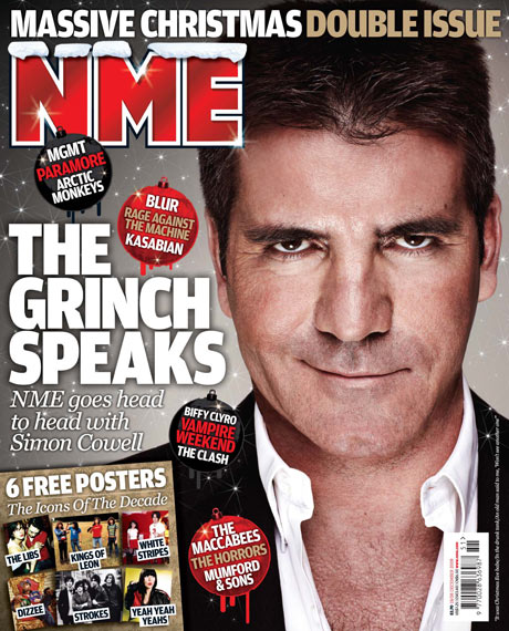
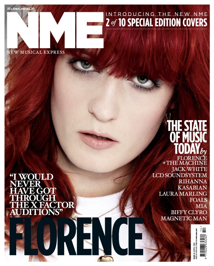
As the majority of music magazines do (including Rolling Stone), NME makes use of the colours red, white and black in its logo. Its masthead changes from cover to cover to suit the layout for that particular issue, and the layout of each issue depends on the artist being featured. In this way, NME adapts well to each artist's style, capturing the attention of those interested in that style. 

Something that is consistent in each issue, however, is the use of Sans-Serif font for the masthead. Sans-Serif is a font which is considered contemporary, youthful and fresh, and attracts a young and modern target audience. The featured artists are usually young and often relatively new to the music industry, which also attracts younger readers. Its inconsistency in colour schemes for each cover of an issue and its bold covers attract a constantly changing and contemporary audience.


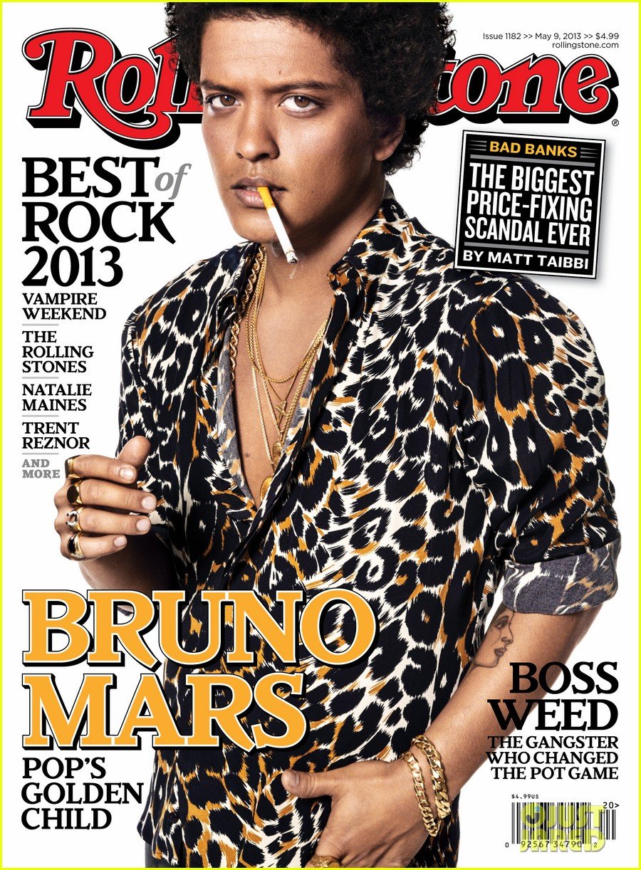
In contrast the slight inconsistency of NME, Rolling Stone's magazine covers are almost always identical in layout and masthead design. The masthead is always across the top of the magazine cover and is in red, white and black, like the majority of music magazines. The cover photo is usually a close up or mid shot and occasionally somewhere between a long and mid shot of the featured artist, and in the majority of pictures the subject is making eye contact with the camera to involve the audience.

The masthead is always in Serif font, which is considered to be formal, sophisticated and established, attracting perhaps an older, more traditional and conservative target audience. Although the photos do feature some young artists, quite often Rolling Stone will feature an older artist, or at least an artist with more traditional music produced, to attract more refined readers to the magazine.